Inspire Anesthesia
Below are some quick descriptions of some of the work we did for Inspire Anesthesia.

We updated their forms (see below) to make them more usable…and more fashionable to better represent their brand. We used clean, bright colors which represent safety, calmness, and precision.
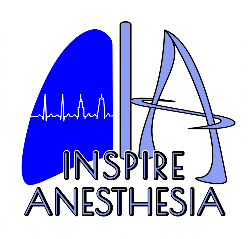
We also designed a few different logos for them to choose to use for all their branded items. A finalist is shown on the left.
Inspire Anesthesia asked for the logo to represent their best qualities: they operate in NYC (well, the surgeons actually do the operating!), they focus on maintaining a strong, stable heartbeat, and they’re safe. They wanted something that said modern, but also classic.
So we designed a logo in the shape of a pair of lungs — embedded letters of “I” and “A” (for their company name) make the thorax and right lung, and a strong stable EKG with a nod to NYC (the Empire State Building and Freedom Tower are two of the four beats) outlined inside the left lung.

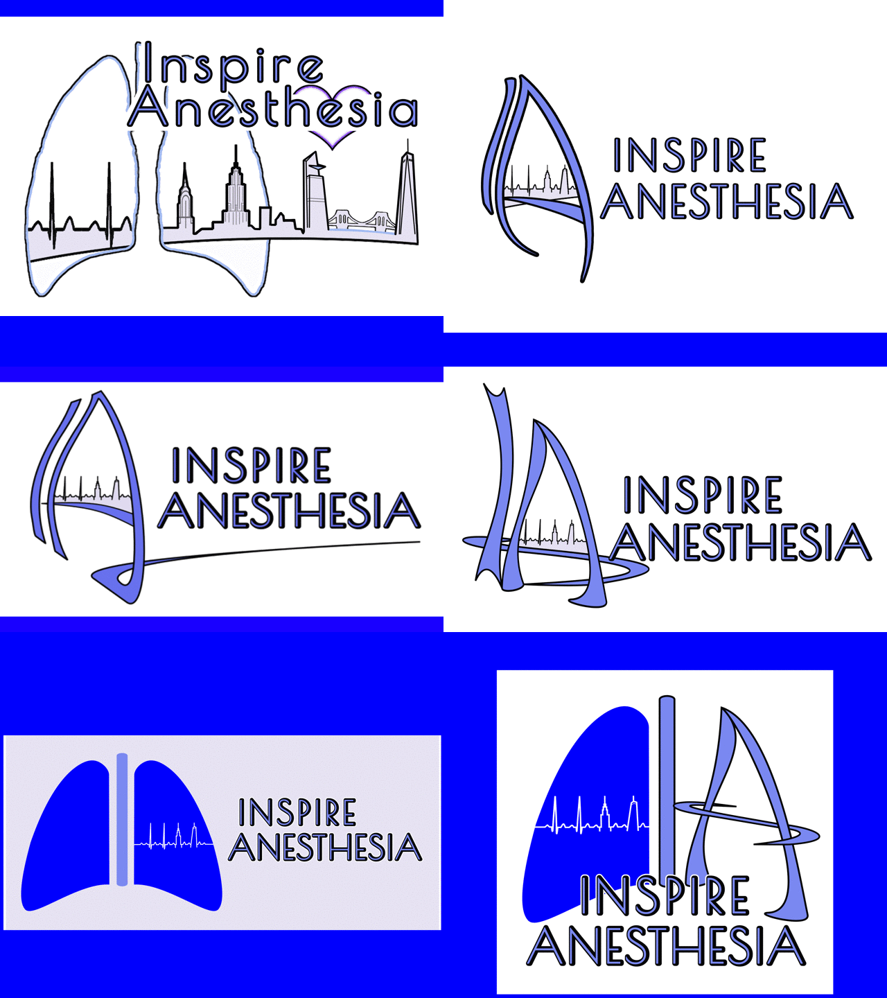
Logo design is an iterative process. Here are a bunch that were developed during the course of our work!

