Midtown Physical Therapy
Midtown Physical Therapy was a small PT practice located in the Bronx. They were embarking on a refresh of their brand — logo, colors, brochures, website, etc. — to coincide with the opening of their 2nd location in the Upper West Side of Manhattan. In addition to producing marketing materials, including promotional giveaways, LuckyDogTechnology also helped increase its digital operations, reducing patient intake & approval from hours to minutes.
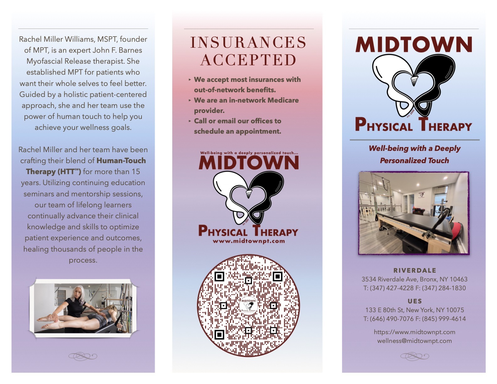
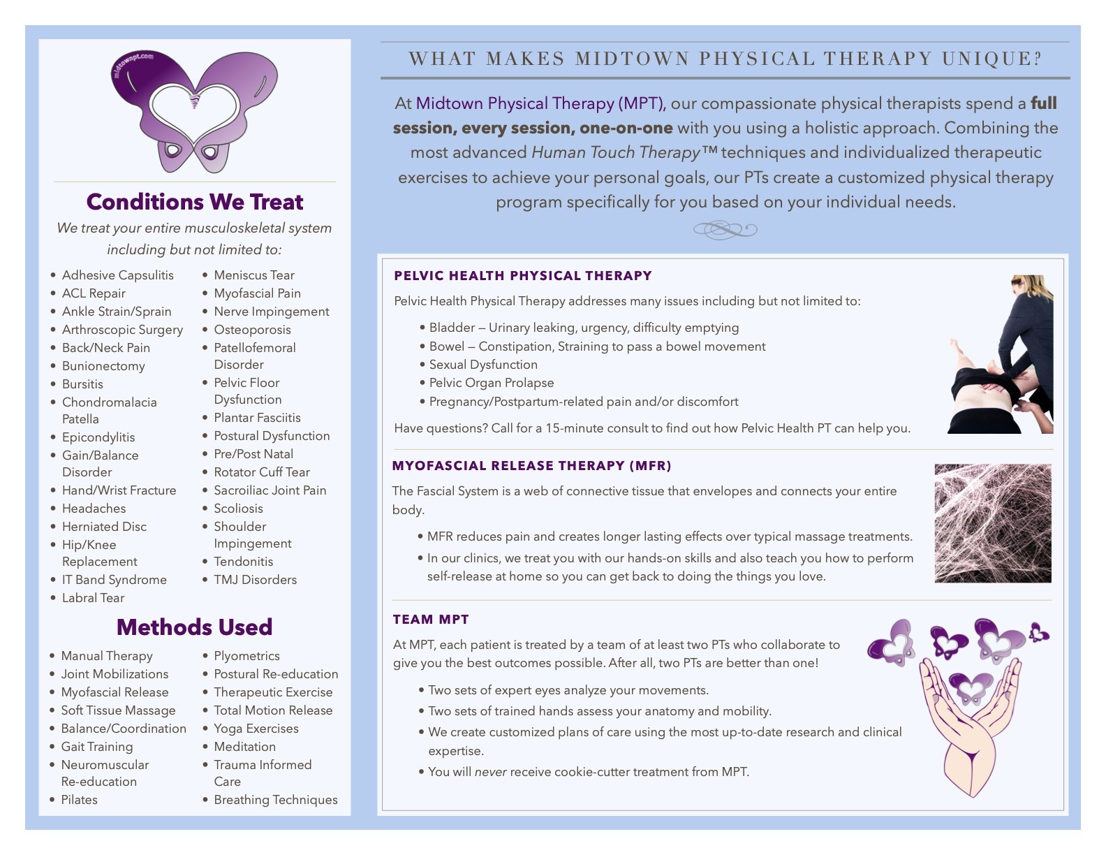
Their logo was one of the more advanced logos we’ve done because it contains a lot of subtly hidden meanings. Yet it’s still simple to use in various ways — looks good in print, on clothes, on giveaways, and online. Its main logo represents butterflies, hearts, and hips all at the same time. It represents balance (note how the hip is “balanced to the T”). It represents inclusivity and wholeness as the white & black hips spiral together to fuse into shades of grey.
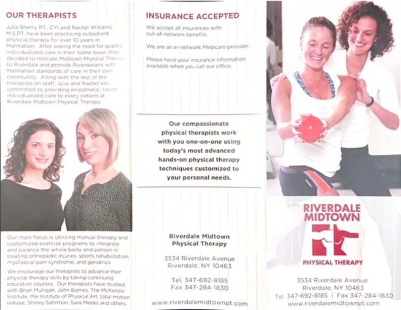
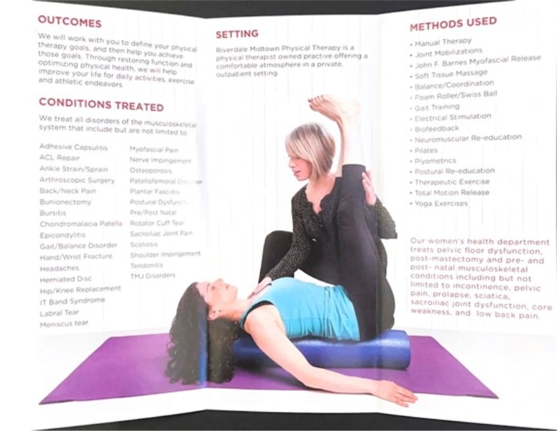
We designed many coupons, flyers, and branding products throughout our engagement. Below you will find a comparison of their new and old introductory brochure.
By the way, if you’re ever in pain, be sure to visit one of their PTs and they’ll have you on your way to wellness in no time! Tell them LuckyDog sent you!