LuckyDog Logos
Logos are always fun to do because they’re always challenging to find that balance of form and function that leans towards cool but away from kitsch. Unless of course it’s kitsch that you’re going for! We don’t judge in what style our clients want to use to represent their brand. Of course, we’ll gladly give you our opinion...but only if you want it!
We’ve done quite a few logos for real and some just for practice! Below you can find a few logos that we’ve made.
Midtown Physical Therapy
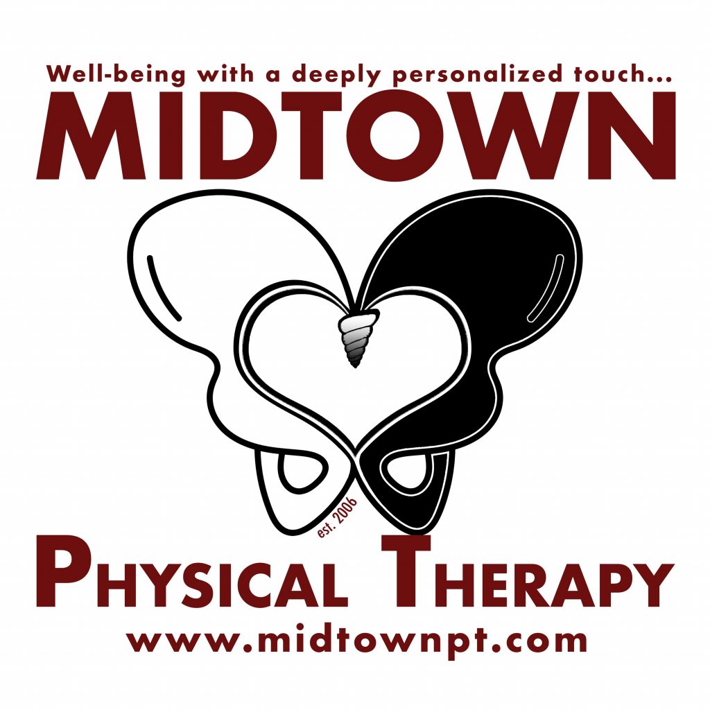
In addition to being very functional, MPT’s logo contains lots of subtle, hidden meanings. It looks good in print, on clothes & giveaways, and online. In the shape of the letter M (for the company name), the logo represents pelvic hip bones (as Pelvic Floor Therapy remains one of their core differentiated services). At the same time, it gives an allusion to butterfly wings (an owner favorite) and the whitespace inside the hips creates a heart (another favorite). It represents balance (the hip is “balanced to the T”) and gait/balance is an important construct for physical therapists. Lastly, it represents inclusivity and wholeness as the white & black hips join together to create a spiral coccyx and ultimately fuse into a blended black & white gradient.
Care Chairz

Care Chairz never had a logo, so we could start completely fresh. The logo represents exactly what they do which is to provide seating options for people suffering from invisible disabilities that make it very difficult to walk or stand for long periods of time. Even though we came up with some cool designs incorporating the C’s of their name as wheels of a wheelchair, ultimately the charity founder did not want to accentuate a wheelchair as the charity serves more than just the wheelchair-bound. When space is at a premium, we can use just the three circles (inside the R) as a lead graphic to represent the company. At some point, we’ll add shading to the circles so that “CC” will be visible in the first two.
Inspire Anesthesia
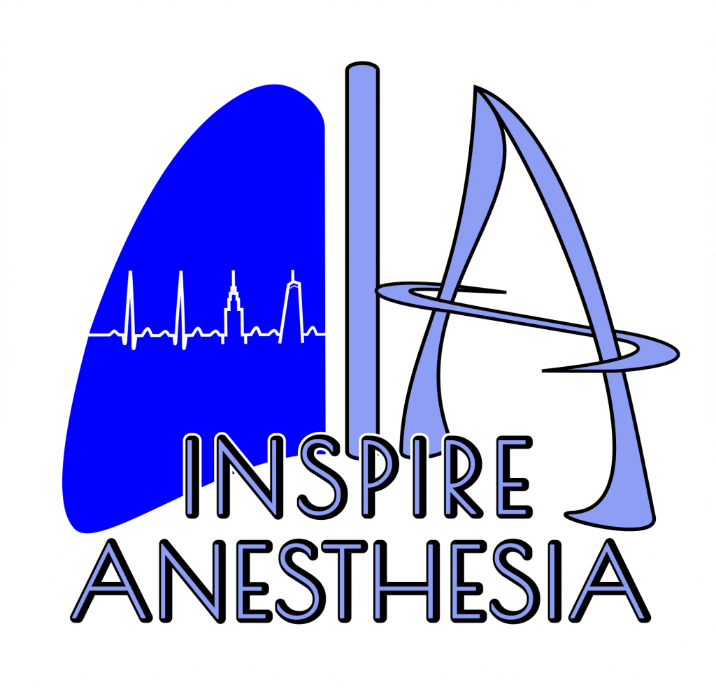
Inspire Anesthesia was all about creating something that connoted medical precision, confidence, safety, cleanliness, modernity, and care. And of course, their logo had to include allusions to NYC, to lungs, and to heartbeats.
Again, we came up with several different high-level approaches and let the client choose which one they wanted to pursue further. It went through tons of iterations and each style of logo had various reasons and options that one could use for the final selection. Ultimately, it comes down to just sitting on a logo and letting your favorites speak to you! Even though there are many options to sift thru, when a client finds one or two they love, they’ll let us know because it’s just something they end up just feeling in their heart.
Breathe & Believe Yoga
Breathe and Believe needed a logo and some signage for the door. Unfortunately, Covid impacted the move into a new studio, and so nothing was fully finalized. But we think there were some cool potential designs that came from the project.
There were several characteristics that were needed for this tridoshic based studio’s logo and signs — triangles, breath, and colors were all very important. As were representations of some base elements — air, wind, water, earth.
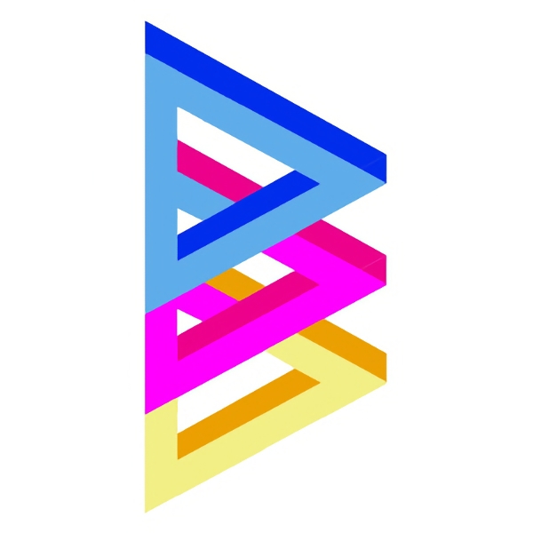
My favorite designs for potential logos are depicted in the slideshow below and one of my favorite logo symbols is to the left. It contains three primary Escher-like triangles that overlap (very tri-doschic) in the shape of a B and a B (for Breathe & Believe) where the blue and pink triangles comprise the first B and the pink and yellow ones comprise the second B.
Jacob Asset Management Forward Fund ETF
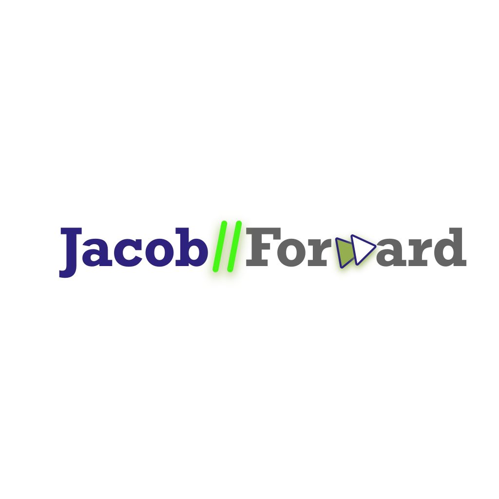
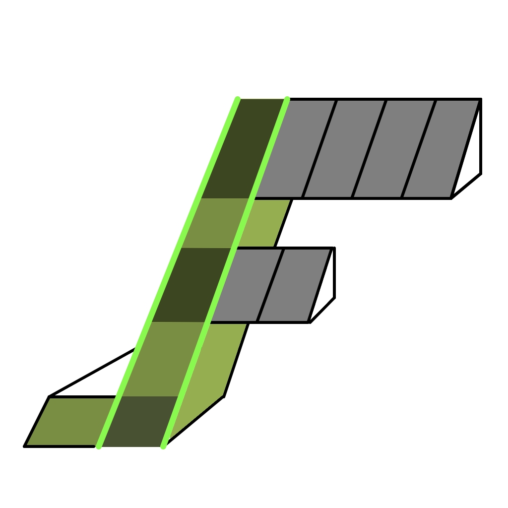
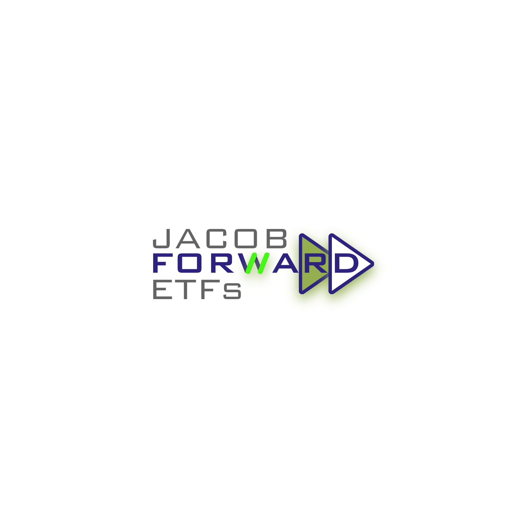
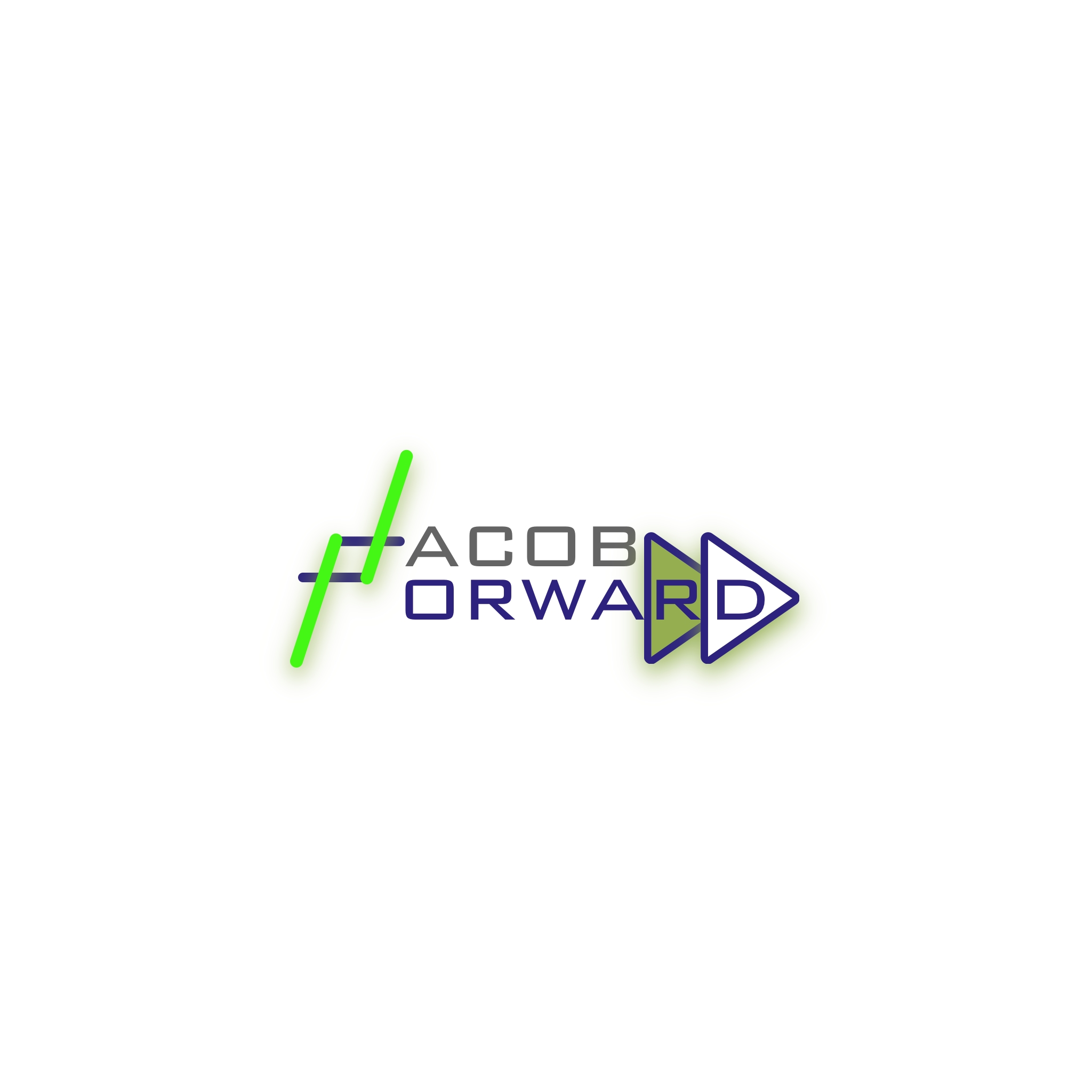
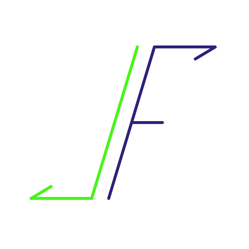
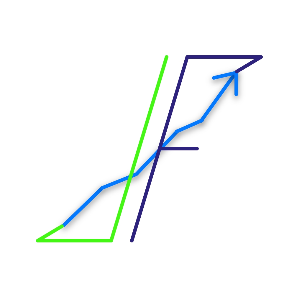
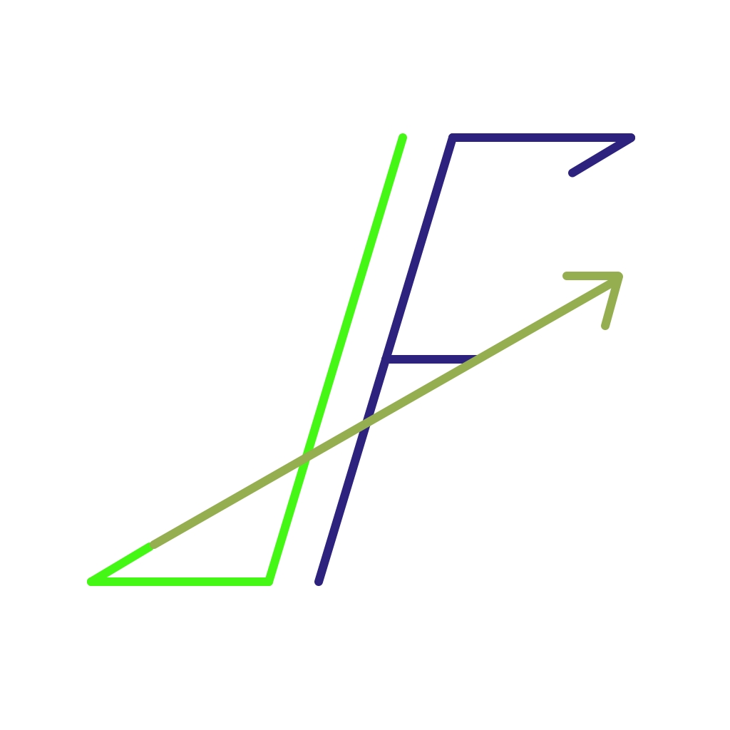
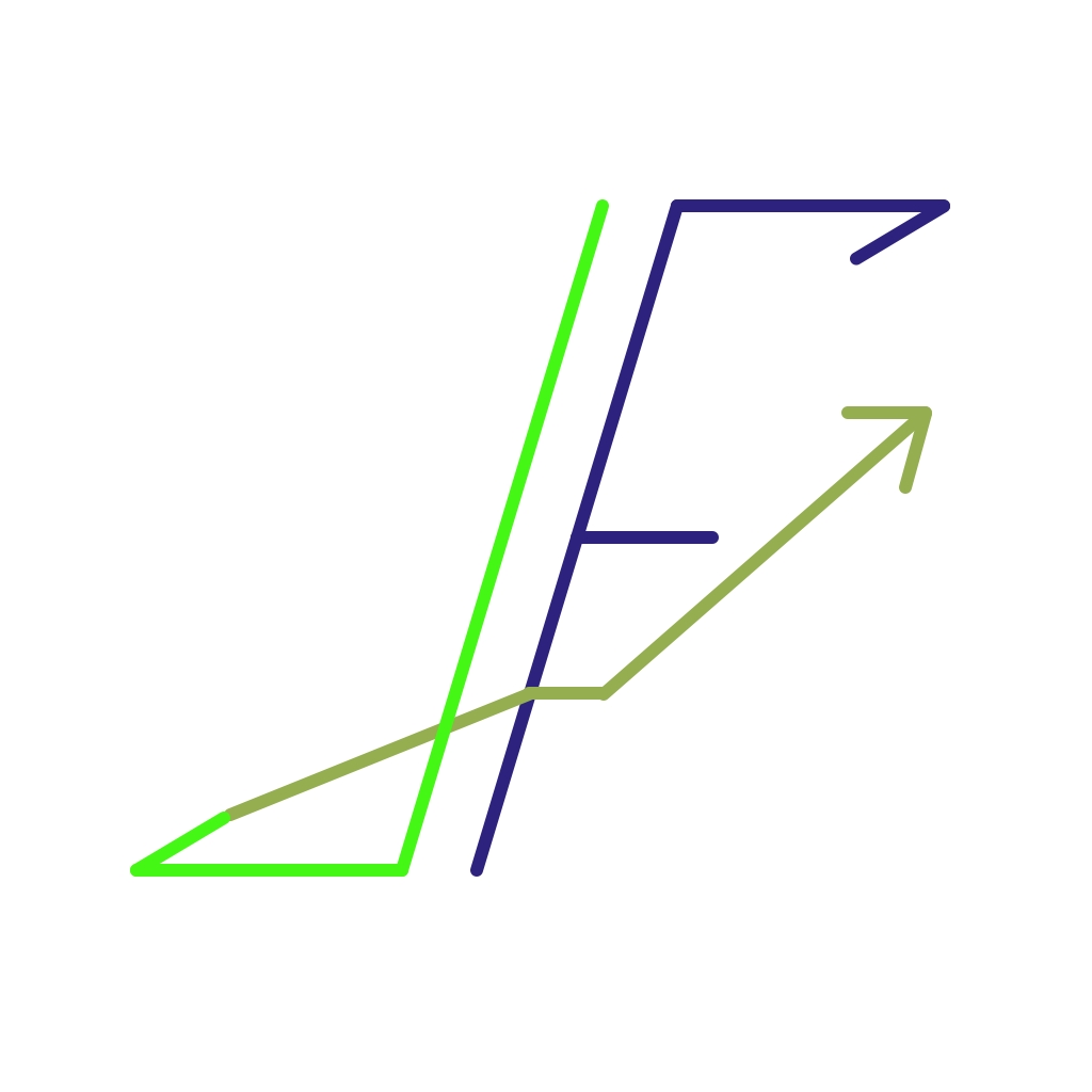
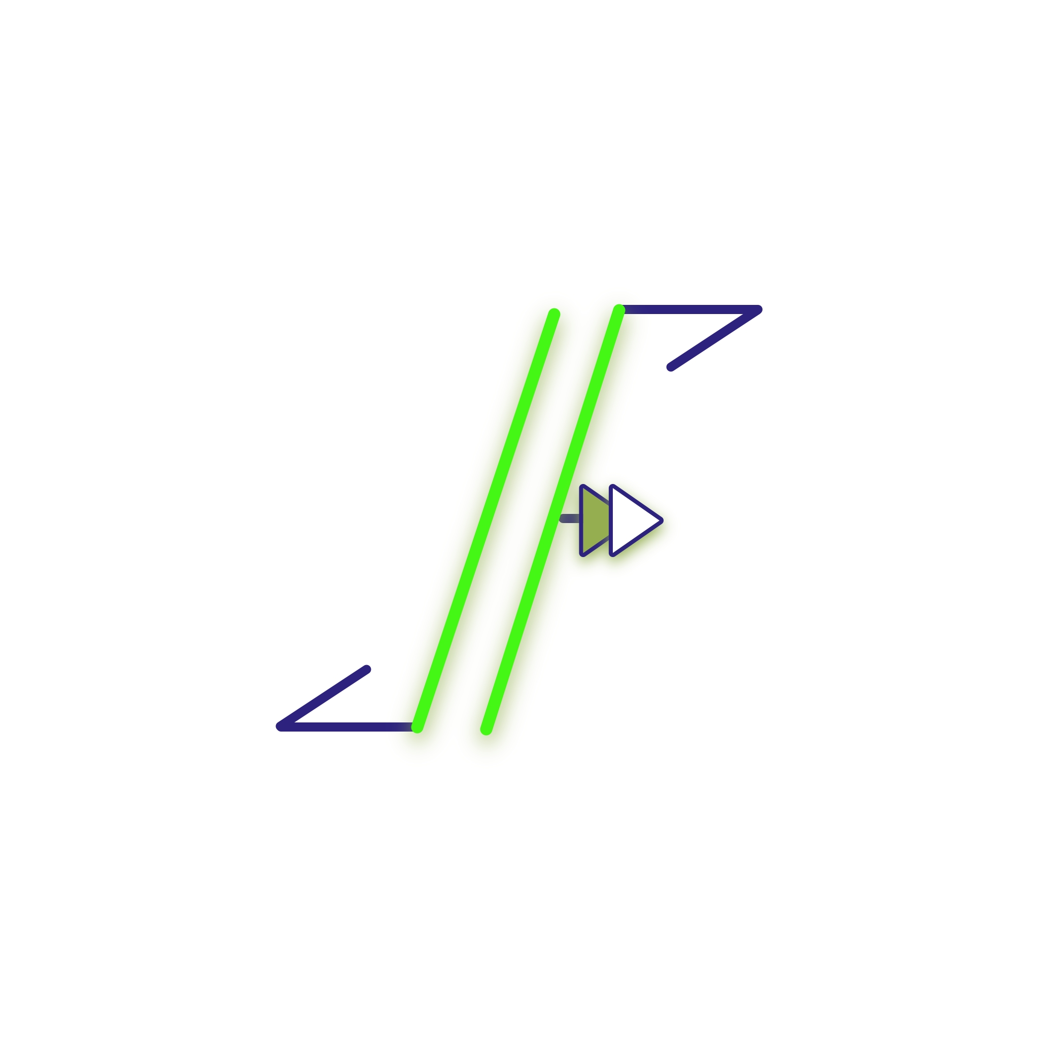
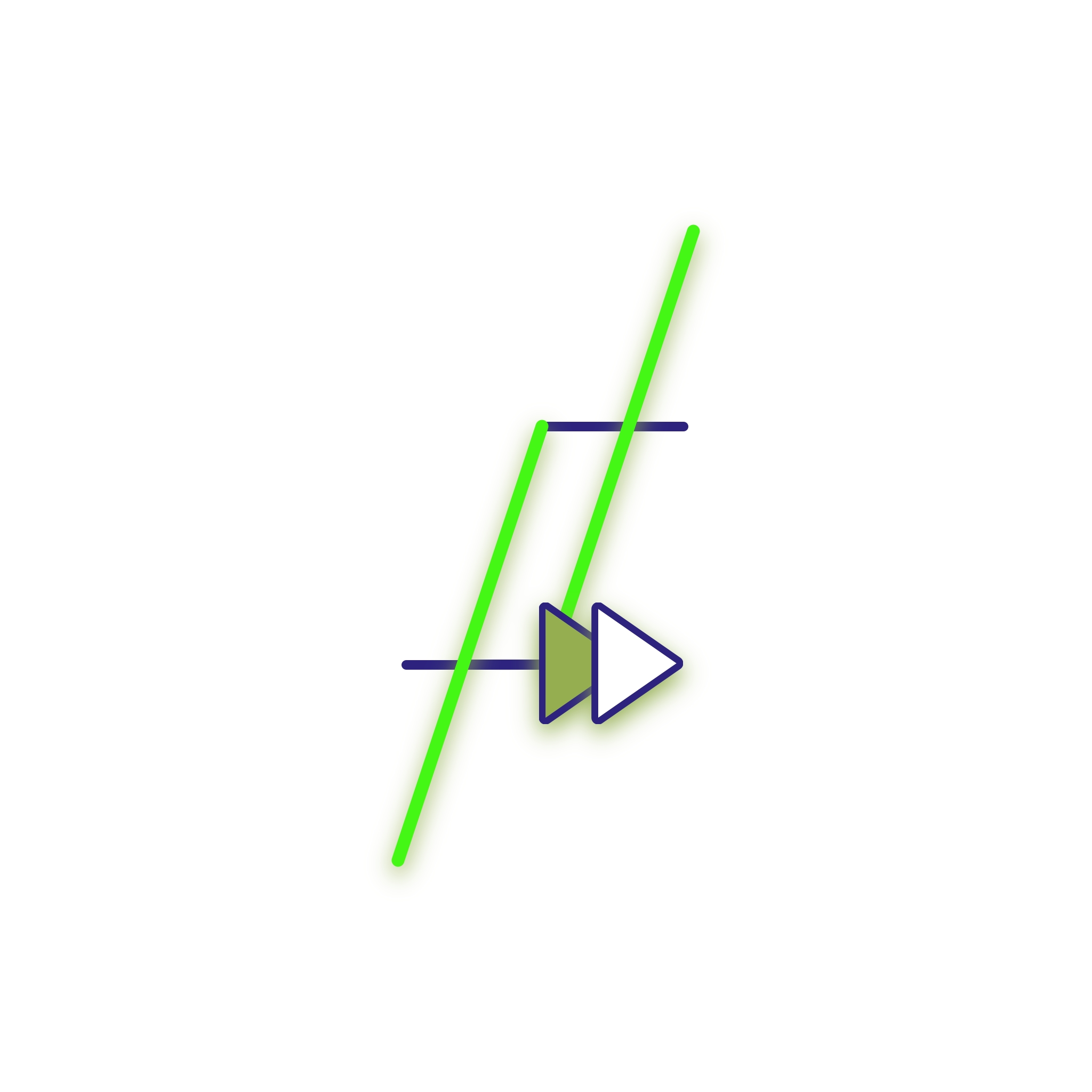
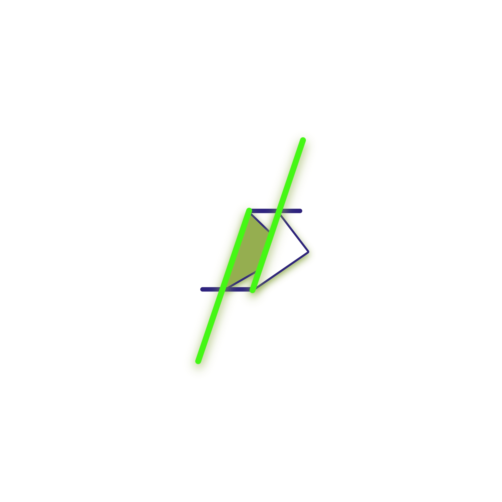
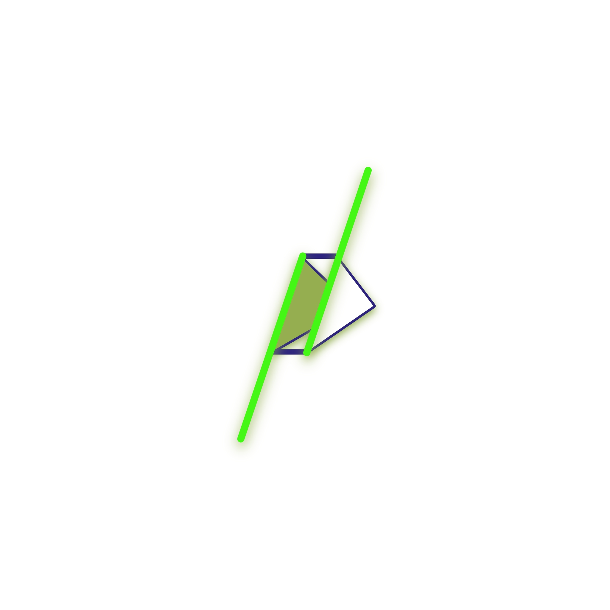
While this never was a real project of mine (shameless plug: my brother, Darren Chervitz, works here; you should invest in anything JAM!), I did some designs just to get practice in this line of work. Humbly, I actually think there was real potential with some of the stuff I created, even if they ended up officially using something else that had a very minimalist approach (but it did have a feature I liked which I borrowed to use in some of mine). Minimalism, which appealed to the GenY and Millennials then, was the style of the day. While it’s still somewhat in vogue, the basic rule for logos is still “whatever the client loves” — whether it’s just a symbol with a font (think NIKE and their swoosh) or a graphic that incorporates the company name (think Starbucks) — it’s all good if it’s memorable!
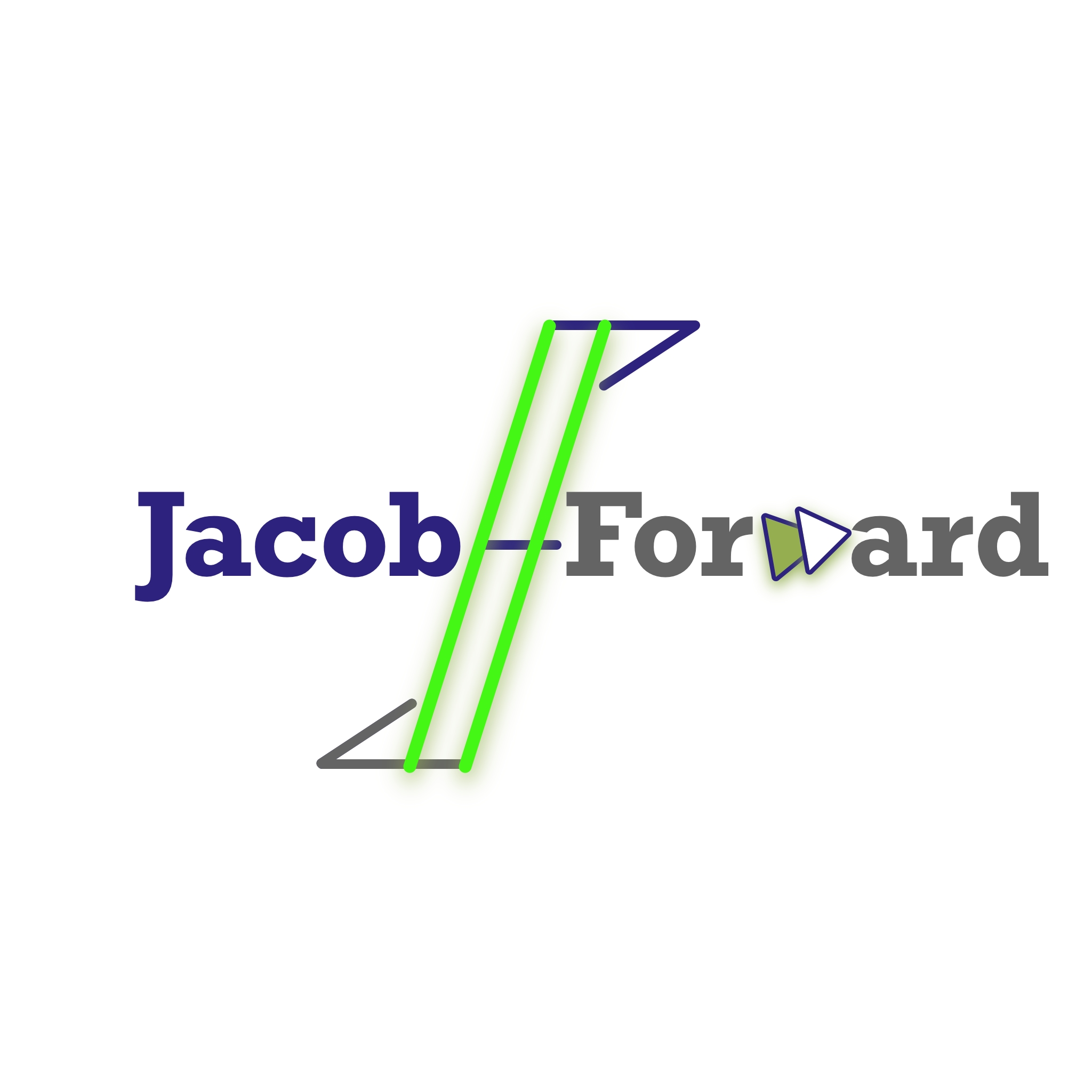
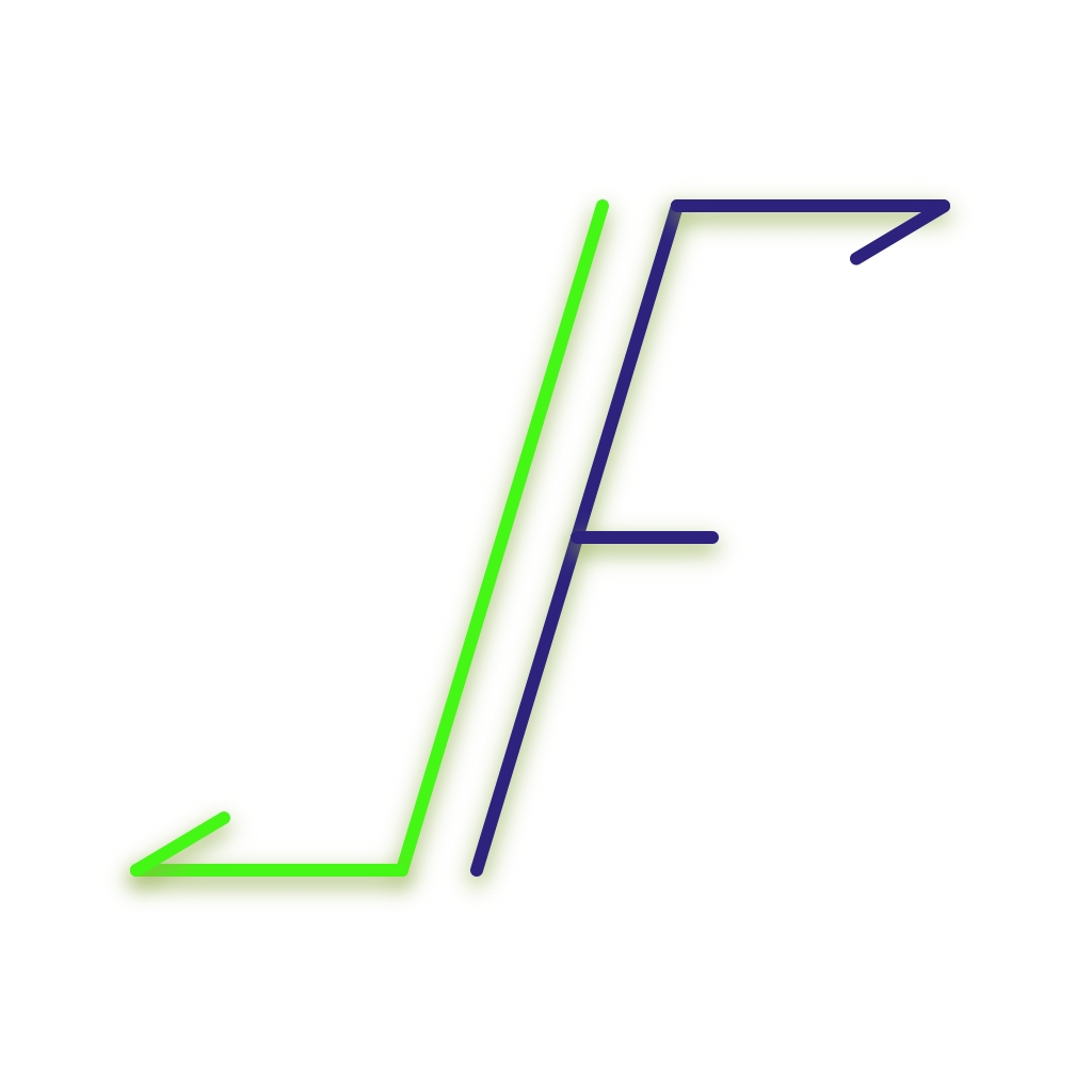
The logo was to represent a new futuristic tech fund that JAM was putting together. So allusions to moving forward and the Internet were important messages. To the left you can see the double forward slash (think web URL) and the double arrow (fast forward) making the letter W. Below you can see a slideshow of all the other iterations that were created.
